A beautiful design does not mean it’s profitable for customers. Web designers must keep in mind that your customers care about not only how beautiful your design is but also how functional they can work with and how profitable they can get from. We deeply cover these 9 secrets for you with the belief about the prominent web design 2017.
- The collaboration between Designers and Developers
Yup, we mention to the collaboration between designers and developers which is a decisive factor for a productive website. Though designer’s teamwork in a separate aspect with developers, and that means more collaboration and better communication.
3 tips to get better collaboration between a designer and a developer:
- Be more pragmatic with decision-making
- Make the engineer’s job as easy as possible
- Communicate constantly and respect the engineer’s opinions
Perfect designs can be made from the sticky relation between designers and developers. Trust us! By this way, you can bet 2017 will bring both improvements to those platforms, and all-new options. When developers got clear with the ideas of the design, saving time for creation is the great thing the own. Similarly, designers should spend time on crafting theme process to give suggestion and exactly know what developers wonder and discuss for the best solution.
- Layouts and Contents matching
Layouts keep the vital role always, but layout let the content shine, which will be double great. Both of them are indispensable and stick together.
To be the truth, web design trends 2017 tend to show high-quality content, and the mission of the designers is how to present the content beautifully and delightfully. And the attention top “fatter” and “minimalist design” seem to be more favorable.
- Being Mobile-Responsive always
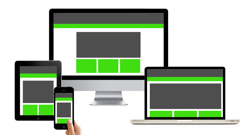
The mobile experience is the must-follow during the crafting site process. Users care a lot about this feature on any websites they like or follow. You can work fine on the mobile, completely right.
These following statistics will show you how important the mobile-friendly feature is. According to Google, 1 out of 2 people said that if they like a business, they will use them less often if the website isn’t mobile-friendly. And the number of customers who are gonna buy products and services accounted for 70% of the available mobile friendly eCommerce sites.
- Let Social Media be enough
Certainly, showing that you are on social media is a must, but if it’s overwhelmed, your business might be down. You should keep Social Media be enough on your site. Let put you in the customer position; you absolutely are, sometimes. Web designers should present clients how profitable these designs can be with great layouts, rich contents and the sticky relation between developers and designers instead of over promotion.
- Getting at least three email Opt-Ins
It’s undeniable that, a solid email list building is an effective strategy for a better business.
That’s why web designers need to present for customers how the designs can attract more and more subscribers.
Smartly, you should create attractive opt-in email form which wakes up the curiosity of customers and is willing to be your potential subscribers.
Here are three prominent positions on your sit to put the email registrations.
- At the top of the page
- At the bottom of each blog post (Blog page)
- Before the footer
- In the footer
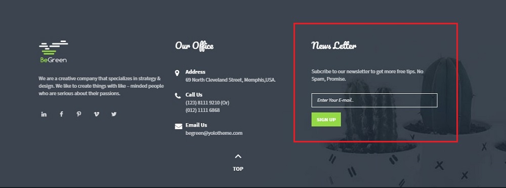
BeGreen – a planter WordPress theme greatly did this feature with its newsletter in the footer:
- Integrate Premium Plugins
The need of customers rapidly change, and you can guess what they wish to customize always. Let’s show customers which premium WordPress Plugins your theme included, and how profitable they can get from them and a perfect purchase will be a promise.
For example, when you purchase any themes at YoloTheme.com, you always get at least these two premium plugins: Visual Composers and Slider Revolution which save your budget up to $53. These plugins will shorten the building time a lot, and you get more time for the creation of your distinguished site.
- Constraint-based design tools
Yup, we need to learn how to take advantages of design tools which save the repeated work for a designer. Like a revolution of design tools, in details, we would like to mention Constraint-based design tools which decrease the time designers need to rebuild the same screen over and over for different device sizes and resolutions.
And the massive time you spend for the similar work on other devices. This tool is a revolution which makes your design suitable for the current rapid development. Less work for designers for the win. When your design is profitable for you, and certainly to your customers as well.
- Take advantages of Free Stock Photos
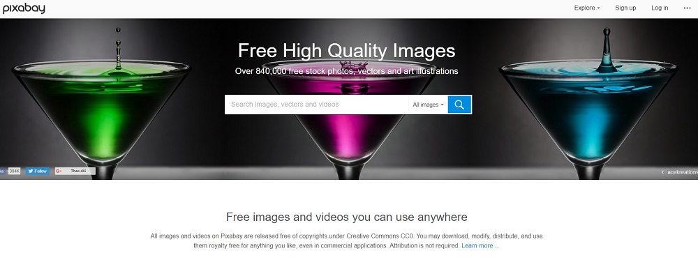
Keeping the thought about the bad quality of free stock photos is a wrong idea of any designers. A smart one should learn to take advantages of free photos sources and when you need the paid sources. The flexible combination of your design is the best way to create beautiful and profitable designs for your customers.
You get the miracle photos at these 10 free stock photos below with quality photos! Let’s click and enjoy Now!
- Trendy Color 2017
Unlikely, the trendy colors in 2016 with light colors as pastel, web design color 2017 tend to bright, and natural colors designs. Greenery, the color of 2017 – the refreshing and revitalizing shade, is symbolic of new beginnings. And there is no exception in web design, the prediction for a burst of greenery designs from the beginning of refresh 2017.
Conclusion
Web designers must update the latest trend in each design to meet any new requirements from customers. Don’t be left behind with the non-improvement designs which are non-profit for both designers and customers. Blow the new wind through your designs, and you might not know where they are blown into, but they go further.


