Minimalism keeps the trends for few years and also be the design trend for future, and minimal and minimalist themes are still in high demand. So what exactly is it and how can you take advantage of this trend to make your designs stand out.
Minimal design allows for more flexibility and customization with the creation which designers can show more personal style and create their own design which is definitely different among millions of designs.
When you are gonna build up a site that following the minimalism, you should deeply research on the field to learn how to make the site is suitable for your business target. The article will collect the best tips to build up an effective minimalism and we will show up all in Rubino – an amazing minimal design from YoloTheme to help you get the best understanding.
#1. Break some RULEs
Any minimal design you need to be different and breaking the regular rule will give new appearance for your designs. In Minimal design, you must take a risk and give new experiment on your design. Notably, you can break some rules but not all rules if not you will in a mess and ruin yourself.
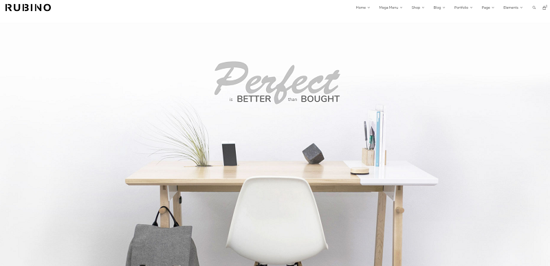
You can see this feature at Rubino with more creative features which is extreme simplicity and minimal to works well as a visual element that is much more fascinating.
#2. Get Consistent
Minimal designs are incredibly useful to identify your consistent and very memorable brand by keeping the logo, the color palette super simple and minimal and focus users to the main content.
You can get a good reference at Rubino with its Logo and selected palette which effectively keep the design on minimalism.
#3. Be Smart
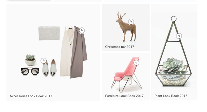
Minimalism requires you need to smartly use illustrative elements how to be suitable with your designs. You should carefully check where and when you should use these elements. For instance, Rubino combines illustrative elements so reasonably and good enough.
#4. Let’s Get Functional
Absolutely functional! As you know all minimal designs target users to the main content, so you must make the navigation of the content pages quick, easy and functional. Then how to do this, you should create a clean and clear typographical hierarchy.
Rubino express this feature so clearly with the unique future the minimal theme reach: offering single product builder for your eCommerce site which is so much convenient for users.
#5. Texture
Though flat colors are popularly used in most the minimal design, you should add more texture to make your design in depth and effectiveness without forgetting the minimalism.
The texture works particularly well when it’s balanced out with clean, and flat color, and give your design an attractive look instead of super simple look as other minimal designs.
#6. Find Your Balance
Balance all the elements in your design is one of the decisive factors whether your minimal design is successful or not. Such a good example! You need a balance between photographs and typographical elements and never overuse any elements in your design.
#7. Make Your Type Visual
Type plays a primary in your design, and there is no exception in minimal designs, it can be visual elements such as applying some opening spread in your design. You can get more understanding in Rubino which successfully use visual elements.
#8. Focus The Content
You never forget the main target of minimal design which is the content. You must use the simplicity of the design to shine your content not just focus on the business page like other WordPress themes.
#9. Not just Black and white color
Though the fact that that monochromatic color palettes are the be all and end all of minimalism, it does not mean you can use other colors to create a minimal eye-catching design. 1- 3 colors are the great option for a perfect minimal design.
As you can see at Rubino, the black and white keep the primary palettes; however, we add some pastel color to make them be more fascinating to customers and be different among the minimal design market.
All in all, minimal design will be the design for the future, so you must get a strict attitude to create an eye-catching minimal design which contains most of the essential features we have mentioned above. And Rubino will be a good reference for your design which is trendiest, an endless inspiration, and most functional theme to run an eCommerce site following minimal style.


