Catching the right trends and applying in your design is the only way that makes your design stands out and be trending. There is a little bit challenging to get all, don’t be afraid, we will help you by collecting top web design trends that will be expected in 2018.
#1. Simplify the Color schemes
Coming at first, choosing an approachable and relatable color palette for your brand will decide your website is branding or not. Simple is the best!
You should choose the bright color for your design in 2018. Users are looking forward to the design that employs bright color schemes. Large, bold graphics, patterns and gradients are taking over web pages, again replacing more traditional design elements.
Alert: It does not mean that you will use bright colors for any design. The selected color should be fitted to your content and the niche you follow.
#2. Create Typography
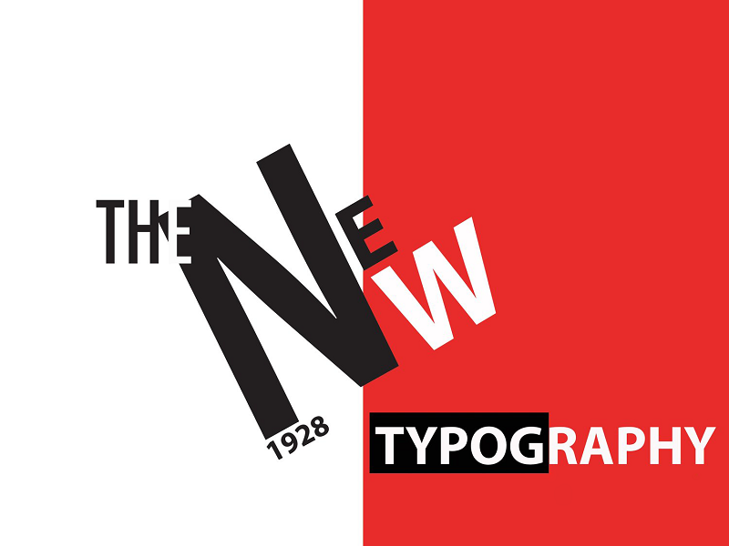
And now it’s the typeface that decides the first impression of visitors to your site. 2018 allows you take a risk in design. For instance, you can break up the spacing of words or change the spacing and weight of the letters, and font mixing also gives users a new look.
Alerts: Typography should be on the home pages only. For blog or news, you should following the readability style that is essential for an easier following.
#3. “Break” the layout
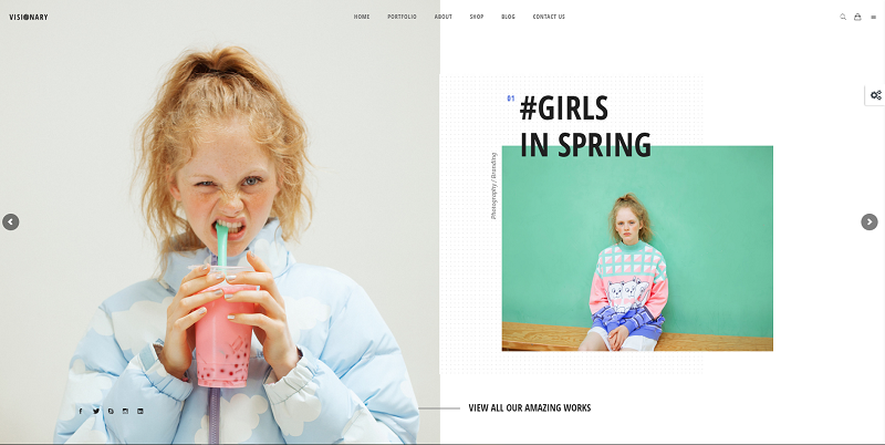
Just breaking make your design different and shines in 2018. Let’s’ make something like creating a hamburger menu, a floating social content instead of the traditional layout. The fashionable trend will attract lots of customers to your site. Also the break the rule can be shown by following the Asymmetrical layouts, using more media, or different sizes and page alignment. You can find the feature almost in creative designs as Visionary, a creative agency theme that successfully breaking out the traditional rule.
Alert: You break but break smartly, you should never distract your viewer with over breaking, guys.
#4.Select Qualified Photo Content
There is nothing to say if not mentioning to Photographs in your design. And designers need to create unique pictures and photos in your e-commerce site designs. A study has shown that more than 60% of users pay their attention to the design that contains relevant and unique photos, and pictures. Hence, you must focus on photo content with informative, quality and unique photos and pictures to give user maximum attention.
Alert: Loading site is the first thing you must note when you use too many photos that might slow down the site.
#5. Use Scalable Vector Graphics (SVGs)
You will see a booming of SVGs that overtakes more traditional file formats such as PNG, GIF, and JPG. So what are SVGs? They are vector images, not pixels that creating lots of advantages for users such as maintaining the quality and not requiring any HTTP requests. Plus, SVGs are necessary for new multimedia experiences in 2018 including 360 degree-views, 3D images, and Cinemagraphs.
#6. Add decorative details
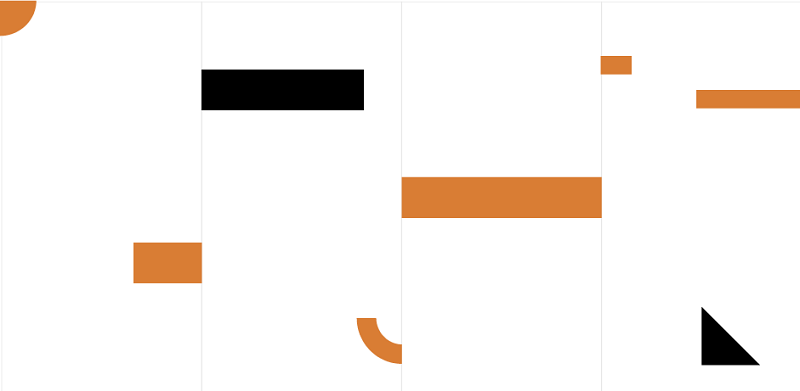
Now you can decorate the site more attractive look. The decoration could be on icons or replace your content– or simply just for decorative purposes. Decorative details are great for adding a little extra attention to certain areas or content on your site.
Alert: Do not add too many decorative details on the site that make viewers get confused and it’s hard to focus on the main content.
#7. Follow Minimalism Trend
Minimalism comes in the popularity of the web design trend 2017 and now it continues the path.
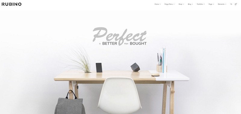
The reason for this trend is users’ patience. You easily lose your customer if the site loading time over 4 seconds. And 2 seconds is the perfect loading time for your site. To reach this target, designers must reduce the number of on-page elements and reduce the number of HTTP requests. And that is the main reason for the booming of minimal designs that is simply perfect. For an illustration, Rubino – a minimal design from YoloTheme is worth to visit.
Alert: The minimalism is only suitable for specific niches, so you need to decide whether your concept is suitable for the style or not.
#8. Add Cinemagraphs
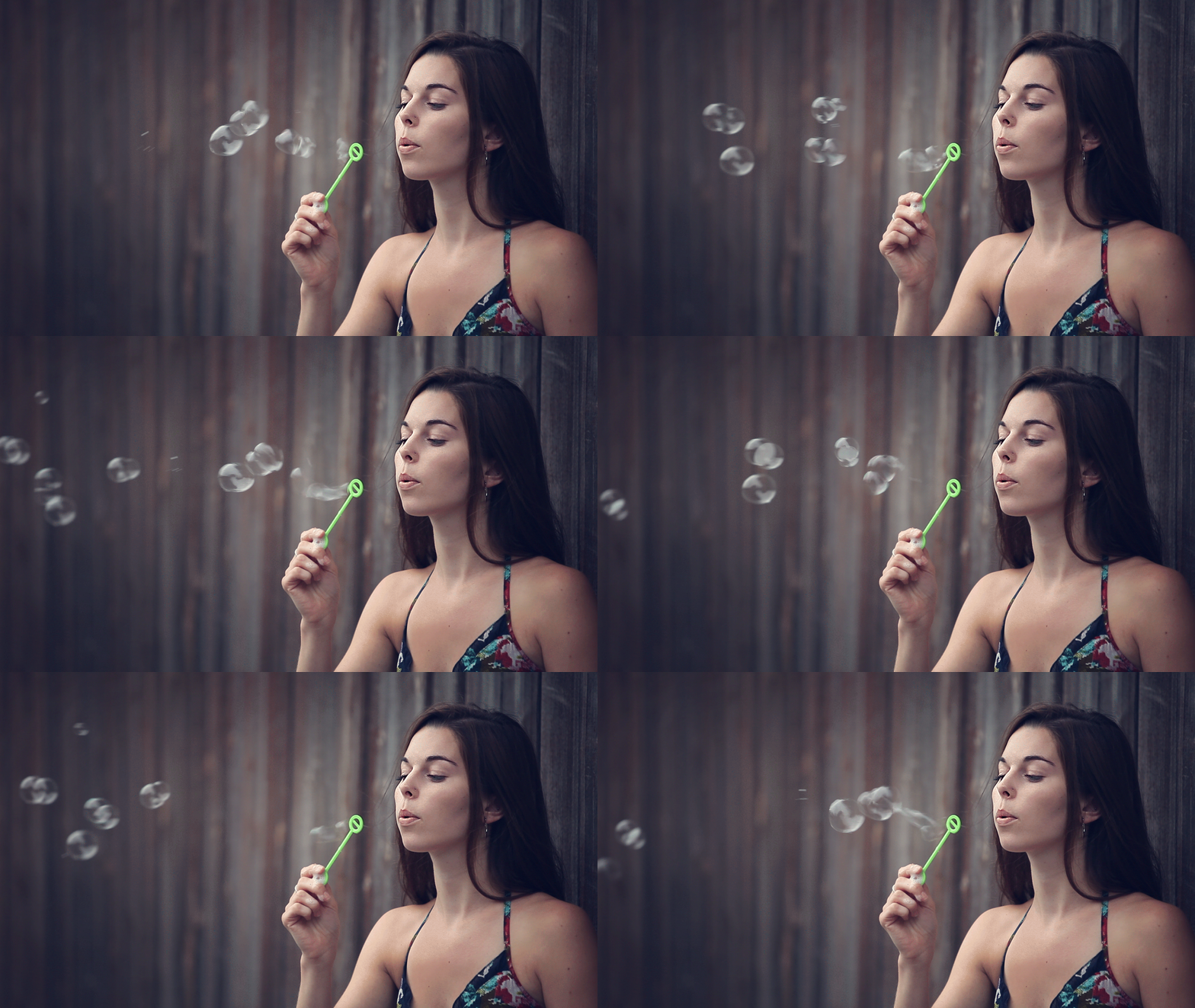
And Cinemagraph is a special thing I want to mention here, guys! Your design must update the hottest web design trend in 2018 with using Cinemagraphs that is a perfect combination of a static image and a full-blown video. Does that mean the site will get a lazy loading with these images like a video? Absolutely No. They are quick snippets to create dynamic images that are different video and not influencing your site loading. For a real illustration, you can see the magic of moving photographs in Harry Potter.
Alert: You should apply this feature with the aim of highlighting or on the home slide only. Don’t overuse it that will result in a “heavy” site that takes forever to load.
Wrap Up,
2018 will be the year of bright colors, bold gradients and animation integration designs that are much more attractive and deserves user better experiences. Follow these trends and your work will shine among the rest. And you don’t forget to note our cautions down to suitably apply them to the design for the best result.

